I’m constantly fascinated by the changes that happen (seemingly beyond my control) when I paint several iterations of the same painting. Some things will improve from one to the next, while other things seem to have magically happened in the first one never to happen again (despite my trying to recreate them).
Several months ago, I wanted to paint a bookmark-sized painting of Tatooine from Star Wars. I like to paint sunsets, and what’s better than one sun setting, but two!
Here are my first four versions, in order of how I painted them from top to bottom.

I started off with my usual sunset technique, and attempting to paint orange circles for the suns. Especially with the small size of the bookmark, the suns are very small and my hands too unsteady to stay in the lines. Over the next three versions, I tried crayon, glue, and paper towel dabbing to keep the suns a light color while I painted the sky over the suns. It wasn’t in that order I don’t think and I don’t remember the order I tried them in. None of them gave me the results I wanted.
Side note: I later learned about resist, which is an actual product you can buy. I tried it on another painting and dislike how it’s applied and removed. It’s essentially just fancy glue.
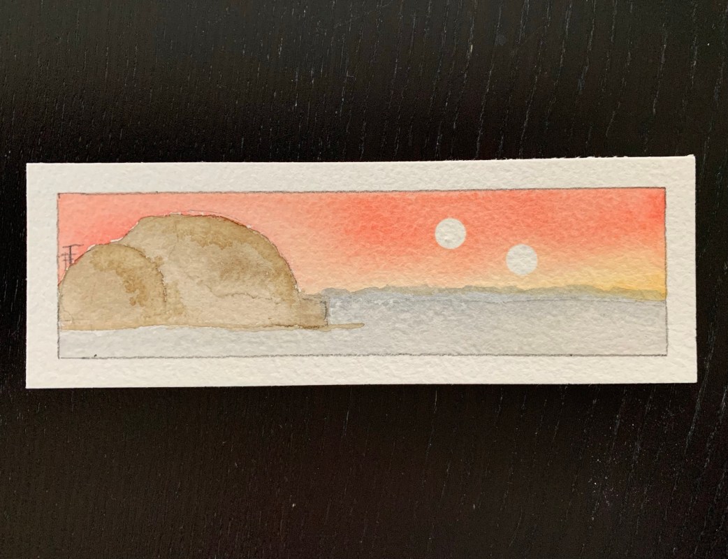
The top three were on lighter weight paper with the bottom one on my favorite Arches cold press 300 pound paper. The last one is also in the final size that I planned to use for bookmarks.
As well as my sun technique changing, you can see the shading of the house changed. I felt the last one was too dark, and liked the way the watercolor splotched in the first two to create shadow and more of the sandy look of Tatooine. The colors changed as I played with the contrast between the house, the sky, the foreground sand, and the distant horizon. Lastly, you can see where I played around with the antenna-like structures in the background.
Here is the final version:

As you can see I really changed the sky. I wanted more contrast between the sky and the suns, as well as the sky and the ground/house. I used painters tape punched out with a hole punch to create perfect circles. This worked really well, though there is a risk of ripping the paper or leakage under the tape.
The proportions of the house changed over the first four, and in the final version as well. It’s probably closest to the first version proportions (one of those things I manage to get right the first time around and have difficulty replicating). I made the house shape by tracing round objects I had handy. I think maybe one was a travel toiletries container, and another was an Advil bottle.
The biggest change is that I made the house bigger relative to the bookmark and slid it all the way left. This allowed me to put the antenna structure more “behind” the house in the distance.
As I mentioned with the first four, I liked the blotchier shading of the house, so I returned to that.
So that’s it, right? No! As it turns out, a friend wanted to commission the bookmark as an 8×10 as a gift for a mutual friend. That meant more chances to play! I would need to change the proportions significantly as 8×10 is much taller than a 2×7 bookmark. And it’s just larger as a whole. Do I add more detail or keep it as is?
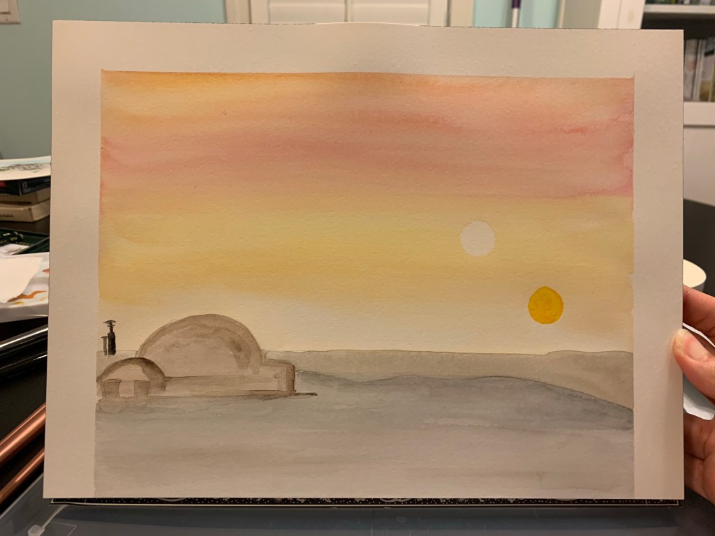
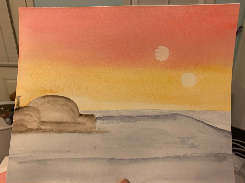
The first full size version was mostly to start to figure out spacing. And to give one more attempt at coloring in one of those suns since they’re larger now. I tried adding more detail to the house, which you can see I did not end up keeping in subsequent versions.

I still don’t like painting the sun, it looks sloppy to me. In this second version, I moved the house, horizon, and suns farther up the painting. Loved the sky coloring, but made the ground a little too blue. In both of these first two 8×10 versions, I made the antenna structure too blobby and big, they lost the antenna look. I accidentally did a cool cloud drag affect across one sun, but couldn’t decide if I liked it, or if I could repeat it.

Just like in the bookmark size, the first versions were on lighter paper. The final version again on my favorite Arches cold press 300 pound. Here was the final version, although badly photographed, I am happy with the results. The sky is similar to the original bookmark. The suns I made with the paper towel and coin technique. You wrap a coin in paper towel and dab it in the wet paint. For the record, these were made with Canadian dimes, as they were the perfect size. Antenna-structures are back to looking like antenna. The house shadowing is just perfect, in my opinion. For the house, I broke down and bought a circle template since it was too hard finding stuff around the house that would be the size I needed.

So that’s some insight into my thought process and what happens when I paint the same thing multiple times. I was happy, the buyer was happy, as was the recipient!

